Client: GRAY SHOP
Project: Logo Design
Graphic Design, Brand Identity
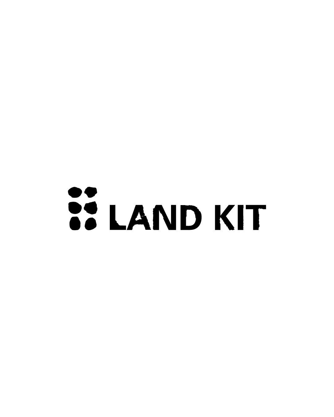
Inspired by stone, a natural material commonly found in the earth, sea, and mountains, the font visualizes a texture that is solid yet irregular, rough yet natural. By incorporating these qualities into the typeface, it was designed to intuitively convey a tough and rugged outdoor mood. The project focuses on translating the brand’s connection to nature and the outdoors into a clear visual language.


